Since there are so many options for choosing and formatting fonts, you might be wondering how to make the right choices.
There are a number of general rules that apply to using fonts in multimedia. Experienced designers sometimes break these rules but when you’re starting out, it’s best to follow this rough guide.
 |
|
Computers generally come with a set of commonly used free fonts. You can also buy or download more unusual fonts from the Internet. However, when you are making projects that will be shared on other people’s computer screens such as websites or PowerPoint presentations, it is important to only use common fonts.
Using unusual fonts in shared projects is risky because even though you may have the font installed on your computer, other people looking at your project on their own computers may not have the same font. This will cause problems when they try and read the text. The text may only show as scrambled codes.
Standard fonts for use on computers
Times New Roman |
Has a classical look. |
Georgia |
Has a classical look and was designed specifically for computer screens. |
Verdana |
Has a modern look and was designed specifically for computer screens. |
Arial |
Is quite plain and is good to use for body text |
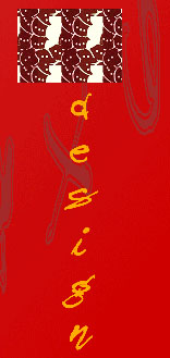
You can still use unusual fonts in your project to make it stand out and look unique. It’s important to give your work your own individual flair. Using unusual fonts adds to the over all design and style of a multimedia product and makes it look more visually appealing and professional. The way you do it is to design your headings or logos and then turn them into graphics.
This way, when people on other computers view your work, they can still see the text even if they don’t have the same font installed on their computer.
Design software such as Illustrator, Photoshop or GIMP can turn text into a graphic file. Common graphic files that can be used are .jpg, .gif, .pict, tiff, .png


